Helping people living with cancer find a supportive community
Context
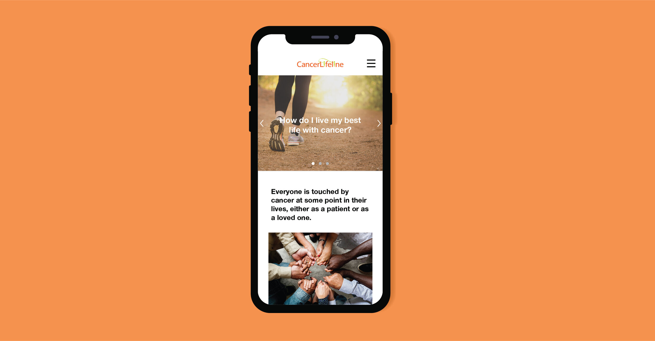
Cancer Lifeline is a non-profit based in Seattle that focuses on improving the lives of those affected by cancer through a range of free supportive services. These services include group classes that aim to provide an informal environment for people to connect with others who have or have had cancer.
When my capstone team met with Cancer Lifeline staff they explained that while they receive positive feedback from those who attend classes, most classes had very low attendance. Additionally, Cancer Lifeline volunteers frequently receive calls from people asking for assistance navigating the website so they could find and/or register for a class.
Client Goal
Increase class registration and attendance by 10% in 2019
Problem
Through initial user interviews, we found that the existing website’s navigation was disorganized and overwhelming, especially for those who are emotionally drained from fighting cancer. (I’ll dive into this research further in a moment)
Therefore, my team and I asked:
How might we help people affected by cancer find classes that suit their needs?
Role
User Experience Designer
User Research, Wireframing, Visual Design, Prototyping and Testing, Project Management
Team
Adrienne Peck, UX Designer
Yang Yu, UX Designer
Client
Cancer Lifeline
Duration
3 months, 2019
RESEARCH & DISCOVERY
Defining Cancer Lifeline’s Users
When we first met with Cancer Lifeline staff they struggled to define their user demographic aside from “people who have experienced cancer”.
After speaking with existing Cancer Lifeline users, it became clear the majority of their class attendees were women above the age of 50 who have or have had cancer.
However, this only represented a fraction of the population in Seattle who is affected by cancer and that can ultimately benefit from Cancer Lifeline’s services. Not to mention that Cancer Lifeline’s website analytics revealed both men and women of all ages were visiting their website.
Ages
Gender
These numbers show that anyone can be affected by cancer. So my team and I started to ask ourselves why there was only a small demographic attending Cancer Lifeline’s classes. How can Cancer Lifeline’s website encourage the diverse group of people affected by cancer to utilize their services and attend classes?
User Interviews
Due to HIPAA regulations and the sensitive nature of cancer, Cancer Lifeline could only provide a few volunteers for us to interview. That said, my team also chose to interview people we personally knew who had been affected by cancer.
We interviewed 14 people:
Those currently using Cancer Lifeline’s services
Cancer Lifeline staff
Friends and family who have been affected by cancer
The interviews had two parts. The first focused on hearing each person’s cancer story to understand the emotions and behaviors associated with cancer. In the second part we observed them finding and registering for a class on Cancer Lifeline’s website so we could understand the existing pain points.
As we reviewed our notes and recordings from each interview we started to see how the pain points experienced when finding a class were more intense for those experiencing the emotional toll of cancer.
One user compared having cancer to having a second job. Between all the doctor visits, research, and treatment it’s extremely exhausting.
“Seeking the physicians and researching the treatment process was more involved than I ever expected. I had to be proactive on my own and it took a lot of time and energy.”
— Cancer Survivor

Classes are presented in a long list with very little hierarchy. This is overwhelming for anyone to search through, let alone someone who is experiencing brain fog from cancer treatment.

While date, time, and location are necessary, people also want to know things like how many people have signed up and what the facilitator’s credentials are. Cancer has enough unknowns as it is. The more information there is about a class the more comfortable they feel about attending.

The registration process offers little transparency about what Cancer Lifeline is going to do with a user’s personal information. Additionally, when a user has completed the registration form there is zero feedback confirming that they have successfully registered. This is both confusing and unsettling.
We also learned about “chemo brain”, which many cancer patients experience during their treatment. “Chemo brain” refers to cognitive changes such as trouble concentrating, easily forgetting things, difficulty learning new things, or taking longer to finish a task. All of this can make it difficult to navigate a disorganized website.
Below are just a few of the pain points we identified during our interviews.
DESIGN PROCESS
Defining User Flow
To better visualize the gaps and pain points in the class search and registration process, I mapped out the current user flow.
From here we were able to infer where we could improve the flow by incorporating an advanced search, clarifying account creation vs. class registration, and encouraging users to remain on the website after registering for a class.
Wireframing
We narrowed down some ideas and started visualizing our solutions by sketching wireframes. I chose to hand-sketch our initial wireframes so we could rapidly critique, test, and iterate the design. This also helped us (and our usability testers) focus on the navigation and hierarchy without getting hung up on specific content or graphic details.
Prototyping and Testing
We tested these wireframes with five users who we had previously interviewed. Early and rapid testing revealed a variety of problems in the initial designs that we needed to correct.
Finding 1: Users just want an organized list that they can filter
We originally thought users would like the ability to toggle between a list view and a calendar view when searching for classes. The users we tested with, however, preferred to just have an organized list that they could apply filters to, such as days and times that work best for them.
Solution: Remove the calendar view to avoid confusion

Finding 2: Users want to see all of the class details upfront
In our first iterations we had an embedded map just below the class time and location. While users appreciated the ability to click on a map and easily route to the location, they struggled to scroll past it on a mobile device and preferred to see all of the class information first.
Solution: Move the map to the bottom of the class details page

Finding 3: People want to know what things cost
Since all of Cancer Lifeline’s services are free we assumed people would know the classes are also free to attend. When testing, multiple users asked what the classes would cost.
Solution: Show the “cost to attend” on every class details page

Finding 4: People are protective about their personal information
Our initial designs did not explain why users needed to provide information like their phone number and zip code when creating an account. We found this made users hesitant to sign up and some even refused to provide information for fear of what Cancer Lifeline would do with it.
Solution: Add a short description about why certain information was needed and how it would be used so users could feel comfortable when creating an account

After these iterations we did one final round of testing with a focus on the following
Language: was it friendly and welcoming?
Hierarchy: was important information easy to find and digest?
Accessibility: were the colors and size of text, images, and buttons easy for someone with impaired vision to read?
FINAL DESIGN
An inviting, easy-to-navigate class search and registration process.
Filters allow users to narrow their search and find classes that suite their needs, while a transparent registration process gives them comfort when creating an account and signing up for a class.
Below are the recommendations my team presented to Cancer Lifeline’s board of directors.
The designs presented to Cancer Lifeline were high fidelity wireframes that did not include photography. I wanted the client to focus on the design of the product rather than get hung up on imagery. For the purposes of my portfolio, however, I have introduced some photography.
Filtered Search
A filtered search helps people easily discover classes that suit their needs.
Clear Class Details
Class detail pages offer the right amount of information and in a clear hierarchy so people understand what to expect.
Date, time, location and cost are easy to find at the top of the page
Photos and reviews show how a class will look and feel
Facilitator photo and bio help people trust who is leading the class
Bulleted class details are easy to skim
Suggested classes at the bottom encourage users to continue browsing
Step by Step Sign-Up
A step-by-step registration process makes users aware that they must log in or create an account to sign up for a class, preventing duplicate accounts and general confusion. Transparent descriptions also help first time users understand why they need to create an account and makes them feel more comfortable about providing personal information.

“We frequently receive suggestions for how to improve, but it’s clear that you really get us, what we do, and how we can be better.”
— Joseph Yurgevich, Executive Director of Cancer Lifeline
RESULTS
Cancer Lifeline’s board of directors were extremely appreciative of our work and have since implemented some of our suggestions.
Given the opportunity, I would test the final design against the existing website with both current and potential Cancer Lifeline users so I can see where there might be gaps in the flow and more opportunities for improvement.
LESSONS LEARNED
Understanding of the problem can transform:
When we first spoke with Cancer Lifeline we framed the problem as “how might we improve the process of finding and registering for classes”, which focused solely on making the website easy to use. After speaking to current and potential users we realized the emotions around cancer have a huge effect on their decision making, so we reframed the problem to also focus on how the website makes people feel.
How to manage a project and team:
I took on the role of leading the team, which meant I created the project time-line, delegated tasks, led weekly check-ins and maintained the relationship with the client while executing research and design work. I learned that frequent and supportive communication is key to leading a successful team and project. It also helps to have a highly motivated team.
Accessible design encompasses more than visual impairment:
I learned a lot about creating accessible designs in a short amount of time by designing for a user base with a variety of visual, physical, situational, and cognitive disabilities. While I can admit that our final designs still aren’t perfect, we tried to present content in a way that would be easy to read and reduce cognitive load.